
Designing Infographics and data visualizations in PowerPoint
Introduction
Welcome to our blog, where we embark on an exciting journey into the world of designing captivating infographics and data visualizations using PowerPoint. Infographics serve as potent instruments for presenting intricate information in a visually appealing and easily understandable manner. At Slide Marvels, we possess the proficiency to assist you in transforming your data into compelling visuals that will truly captivate your audience. Join us as we explore a myriad of techniques for crafting stunning infographics, customizing charts and graphs, and harnessing the power of SmartArt to breathe life into your data presentations. Let’s unlock the secrets of creating impactful visual narratives together!
The Power of Visualizing Data
Data visualization is a game-changer in today’s fast-paced world. Instead of drowning in a sea of numbers and information, it allows us to present complex ideas in a way that is both visually appealing and easy to understand. Let’s explore why visualizing data matters and how it benefits our presentations.
Simplifying Understanding
Visualizing data means presenting information using charts, graphs, and infographics. It goes beyond plain numbers, making it easier for our brains to process and comprehend the message. When we see a well-designed visualization, patterns and insights become clear, simplifying even the most intricate concepts.

Enhancing Retention
When information is presented visually, it tends to stick with us for longer. Visuals create a stronger impact on our memory than text alone. As a result, our audience is more likely to remember the key points of our presentation, leading to a lasting impression.
Captivating Audiences
Infographics and data visualizations are not only informative but also engaging. With eye-catching designs and visuals, our presentations become more captivating. Audiences are naturally drawn to visual content, increasing their interest and attention during our talks.
Planning Your Infographic
Infographics have become a popular and effective way to communicate complex information in a visually engaging manner. However, creating a successful infographic requires careful planning and consideration. In this guide, we will take you through the essential steps to effectively plan your infographic. By defining your objectives, understanding your target audience, selecting appropriate data, and organizing information logically, you can craft an impactful infographic that conveys your message with clarity and creativity.
Step 1: Define Your Objectives
The first and most crucial step in planning your infographic is to clearly define your objectives. Ask yourself, “What is the purpose of this infographic?” Are you trying to educate, persuade, or simply inform your audience? Understanding your goals will shape the content and design of your infographic. For example, if your objective is to educate, you might need to focus on explaining complex concepts step by step, while a persuasive infographic might emphasize data that supports your argument.
Step 2: Identify Your Target Audience
Knowing your target audience is vital for creating an infographic that resonates with them. Consider the demographics, interests, and knowledge level of your intended viewers. Tailor your content and design to meet their preferences and needs. For instance, if your audience consists of professionals in a specific industry, use industry-specific language and data that relate to their work.
Step 3: Select Appropriate Data for Visualization
Choosing the right data is a critical aspect of crafting an effective infographic. Avoid overwhelming your audience with excessive information. Instead, focus on the key data points that support your objectives. Make sure your data is reliable, relevant, and up-to-date. Verify your sources to maintain credibility and trust with your audience. Remember, quality over quantity is the key to a successful infographic.
Step 4: Organize Information Effectively
Once you have identified your objectives and selected relevant data, it’s time to organize your information effectively. A well-structured infographic should have a clear flow of information, guiding the audience from one point to another seamlessly. Consider the hierarchy of information and prioritize what should be highlighted. Use headings, subheadings, and visual cues to aid in navigation and understanding.
Step 5: Create a Logical Flow within Your Infographic
A logical flow ensures that your infographic tells a coherent and compelling story. Begin with an attention-grabbing introduction that sets the context and captures the audience’s interest. Then, progress through the main points in a logical order, building upon each piece of information to support your overarching message.
Step 6: Design and Visual Elements
The visual appeal of your infographic is crucial for holding your audience’s attention. Choose a color scheme that complements your content and aligns with your brand or topic. Incorporate icons, illustrations, and graphics to enhance understanding and add visual interest. Keep the design clean, uncluttered, and consistent throughout the infographic.
Step 7: Review and Edit
Before finalizing your infographic, thoroughly review the content and design. Check for any inaccuracies in data or information. Ensure that your visual elements are conveying the intended message. Seek feedback from colleagues or peers to gain different perspectives and make necessary improvements.
Design Principles for Infographics
Design principles are essential in creating visually appealing infographics. Consider color theory to choose a harmonious palette that enhances readability and evokes the right emotions. Typography plays a crucial role; use legible fonts consistently and vary font sizes to establish hierarchy. A well-organized layout guides the audience seamlessly through the content, supported by the use of grids and white space to maintain coherence. Employ visual hierarchy to prioritize information and ensure key points stand out.
Illustrations and icons aid in conveying complex ideas concisely, contributing to a clean and uncluttered design. When presenting data, select appropriate chart types for clear and accurate visualizations. By mastering these principles, you can craft aesthetically pleasing infographics that effectively communicate your message and captivate your audience. Striking the right balance between creativity and clarity is key, allowing your design choices to complement and enhance your content, resulting in impactful and memorable infographics.
Creating Custom Charts and Graphs
Visualizing data through custom charts and graphs is a powerful way to communicate complex information effectively. In this guide, we will explore techniques for creating custom charts and graphs within PowerPoint, ensuring that your data is presented in a visually compelling and clear manner. Let’s dive into the steps to customize your charts and graphs, select the right chart types, and effectively represent your data to communicate key insights.
Step 1: Choosing the Right Chart Type
PowerPoint offers a wide range of chart types, such as bar charts, line graphs, pie charts, scatter plots, and more. Begin by understanding your data and the story you want to tell. Select a chart type that best suits your data distribution and the message you want to convey. For instance, use bar charts to compare different categories or line graphs to show trends over time.
Step 2: Customizing Chart Elements
To enhance clarity and visual impact, customize chart elements to align with your presentation’s aesthetics. Adjust colors, fonts, and chart styles to match your branding or theme. Emphasize important data points by altering their size, color, or style. Ensure that your axes are labeled accurately, and consider adding data labels or callouts to provide context and make your charts more accessible.
Step 3: Enhancing Data Presentation
To make your data more engaging and insightful, consider using animation to reveal data points sequentially or highlight specific information. PowerPoint’s animation features can bring life to your charts and graphs, keeping your audience’s attention focused on the key points.
Step 4: Incorporating Supporting Visuals
Complement your custom charts and graphs with supporting visuals, such as images, icons, or illustrations. These visuals can help reinforce your message and provide additional context to your data. Use them strategically to add visual interest without overwhelming your audience.
Step 5: Streamlining Data Representation
Keep your data representation clear and concise. Avoid cluttering your charts with excessive information or using too many data series. Simplify complex data by breaking it down into smaller, more digestible components. Make sure your data labels and legends are well-organized and easy to read.
Step 6: Telling a Data Story
Beyond the visuals, ensure that your charts and graphs tell a coherent data story. Provide context and insights into the data trends or patterns you’re presenting. Narrate the data in a way that leads your audience from one point to another, building a compelling narrative throughout your presentation.
Step 7: Review and Refine
Before finalizing your presentation, review your custom charts and graphs thoroughly. Check for any errors or inconsistencies in your data representation. Seek feedback from colleagues or peers to gain different perspectives and refine your visuals as needed.
Utilizing SmartArt for Infographics
SmartArt is a dynamic feature that empowers you to create captivating infographics with ease. In this guide, we will explore how to harness the power of SmartArt to present information in a structured and visually appealing manner. Discover the versatility of SmartArt as we delve into customizing graphics, adding text and icons, and arranging elements to convey complex concepts effectively.
Step into the world of SmartArt and explore the multitude of options it offers for crafting infographics that leave a lasting impact on your audience. Customize SmartArt graphics to suit your content and style, infusing creativity into your designs. With SmartArt, you can efficiently depict processes, timelines, hierarchies, and more, streamlining the presentation of intricate information.
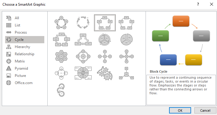
Leverage SmartArt’s flexibility to create visually engaging diagrams and flowcharts, making data and concepts comprehensible at a glance. Unify your data and textual information within the SmartArt graphics, ensuring seamless integration and coherence. With SmartArt, arranging elements becomes a breeze, allowing you to emphasize essential points and lead your audience through a compelling visual narrative.
SmartArt’s user-friendly interface facilitates quick adjustments and refinements, so your infographics always look polished and professional. Enhance your visual storytelling by incorporating icons and images that enrich the overall message. Let SmartArt be your guide in transforming complex information into captivating visuals that captivate and resonate with your audience.
Incorporating Icons and Visual Elements
Learn how to enhance your infographics with icons and visual elements. We will explore techniques for selecting and integrating icons that align with your message and brand. Discover how to use shapes, symbols, and illustrations to enhance visual interest and communicate ideas more effectively. Explore creative ways to incorporate visuals that reinforce your data and engage your audience.
Tips for Effective Data Presentation
- Presenting data effectively in your infographics is crucial to engage your audience and convey your message clearly. In this guide, we will explore techniques to simplify complex data and emphasize key points while providing context. Avoiding data overload is essential to maintain clarity and conciseness in your presentation.
- To begin, focus on the most relevant data points and remove unnecessary details. Simplify intricate data by using charts, graphs, and infographics that visually represent information in a digestible format. Emphasize key findings by using colors, bold fonts, or larger data points to draw attention to critical insights.
- Context is essential in data presentation. Include explanatory captions or annotations to provide additional information and help your audience understand the significance of the data. Avoid assuming that viewers will interpret the data correctly without proper context.
- To prevent overwhelming your audience with excessive data, limit the number of data points and data series in your infographics. Be selective and only include data that directly supports your message. Use data labels and callouts to provide specific values or percentages, making it easier for your audience to grasp the information.
- Remember that clarity is key when presenting data. Avoid clutter and ensure that the visuals are unambiguous and easy to interpret. Strike a balance between aesthetics and information, as overly complex designs can distract from the data’s core message.
Conclusion
Designing infographics and data visualizations within PowerPoint offers a powerful way to present complex information in a visually engaging format. By following the techniques discussed in this blog, you can create visually appealing infographics that captivate your audience and communicate your message effectively. At Slide Marvels, we specialize in designing stunning infographics that make your data come alive. Contact us today to unlock the full potential of your data and create visually compelling presentations that leave a lasting impact. Together, let’s transform your information into captivating visuals.