
Mastering the Art of Color Selection in Presentations
In the world of PowerPoint presentations, where visual appeal reigns supreme, mastering the art of color selection is paramount. At Slide Marvels, we understand the transformative power of color in conveying messages, evoking emotions, and enhancing engagement. In this blog, we’ll delve into the intricacies of color selection and share expert insights on how to create captivating presentations that leave a lasting impression.
Understanding Color Psychology
Colors have the remarkable ability to influence perception and behavior, making them powerful tools in communication. Different hues evoke distinct emotions and associations, which can impact how your audience interprets your message. For example, warm tones like red and orange convey energy and excitement, while cool tones like blue and green evoke calmness and trust. By understanding color psychology, presentation designers can strategically leverage hues to evoke the desired response from their audience.
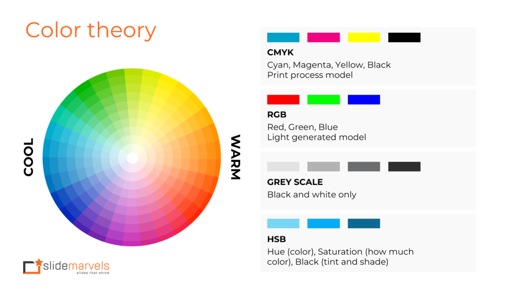
Psychological effects associated with effective color theory application
When it comes to presentations, color isn’t just about aesthetics; it’s a powerful tool that can influence perception, mood, and behavior. Let’s explore the fascinating psychological effects associated with effective color theory application:
Red
Known for evoking strong emotions, red is often associated with passion, excitement, and urgency. It can grab attention and stimulate appetite, making it a popular choice for calls-to-action and food-related presentations.

Blue
Calming and trustworthy, blue is often used to convey professionalism, reliability, and stability. It can instill a sense of trust and security, making it ideal for financial, healthcare, and technology-related presentations.

Green
Symbolizing nature, growth, and harmony, green is often associated with freshness, vitality, and prosperity. It can evoke feelings of relaxation and balance, making it suitable for environmental, wellness, and finance-related presentations.
Yellow
Bright and energetic, yellow is known for its optimism, warmth, and cheerfulness. It can uplift mood and grab attention, making it effective for highlighting key points or adding accents in presentations.

Purple
Often associated with royalty, luxury, and creativity, purple conveys sophistication and imagination. It can spark creativity and inspire innovation, making it a great choice for artistic, fashion, and beauty-related presentations.

Orange
Vibrant and energetic, orange radiates enthusiasm, warmth, and vitality. It can evoke a sense of excitement and urgency, making it ideal for travel, entertainment, and fitness-related presentations.
Black
Symbolizing sophistication, elegance, and authority, black exudes power and professionalism. It can create a sense of formality and seriousness, making it suitable for corporate, luxury, and high-end brand presentations.
White
Representing purity, simplicity, and clarity, white signifies cleanliness and minimalism. It can convey a sense of openness and neutrality, making it versatile for various presentation topics and themes.
By understanding the psychological effects associated with different colors, presenters can strategically leverage color theory. To enhance engagement, evoke desired emotions, and effectively convey their message to their audience. Whether it’s creating contrast for readability, establishing visual hierarchy, or reinforcing brand identity, the thoughtful application of color can elevate the impact and effectiveness of presentations, leaving a lasting impression on viewers.
Maintaining Consistency and Brand Identity
Consistency is key in branding, and your presentation should reflect your brand identity through its color scheme. Incorporating your brand’s primary colors not only reinforces brand recognition but also fosters a sense of cohesion across your marketing materials. Whether it’s your company logo, website, or PowerPoint presentation, maintaining consistency in color usage helps strengthen your brand’s visual identity and establishes a cohesive brand experience for your audience.
Contrast for Clarity and Readability
Effective presentations prioritize clarity and readability, and color contrast plays a crucial role in achieving these objectives. High contrast between text and background enhances legibility and ensures that your message is easily comprehensible, especially in large auditoriums or virtual settings. Presentation designers should carefully consider contrast ratios when selecting colors for text, ensuring optimal readability across different devices and viewing conditions.
Creating Visual Hierarchy
A well-designed presentation guides the viewer’s attention through a strategic visual hierarchy, directing focus to key elements and information. Color can be used to create a hierarchy by assigning different levels of emphasis to various components. For instance, bold, vibrant colors can be reserved for headlines and call-to-action buttons, while muted tones can be used for supporting content. By carefully orchestrating color usage, presentation designers can effectively structure the flow of information and enhance comprehension for their audience.
Accessibility and Inclusivity
Accessibility is an essential consideration in presentation design, as it ensures that your content is accessible to individuals with diverse abilities. Color blindness affects a significant portion of the population. They are making it crucial to select colors that are distinguishable and accessible to all viewers. Presentation designers should strive to use color combinations that maintain sufficient contrast and readability for individuals with color vision deficiencies, promoting inclusivity and ensuring that everyone can engage with the content effectively.
Staying On-Trend Without Sacrificing Timelessness
Trends in color preferences and design aesthetics evolve, and it’s essential to stay current while also maintaining a timeless appeal. Presentation designers can draw inspiration from contemporary color palettes and design trends to infuse freshness and relevance into their presentations. However, it’s equally important to avoid overly trendy or gimmicky color schemes that may quickly become outdated. Striking a balance between staying on-trend and preserving timelessness ensures that your presentations remain visually impactful and relevant for years to come.
Conclusion
In conclusion, mastering the art of color selection is a fundamental skill for presentation designers looking to create captivating and impactful PowerPoint presentations. By leveraging color psychology, maintaining consistency with brand identity, and prioritizing contrast and readability. By creating a visual hierarchy, ensuring accessibility, and staying attuned to design trends, presentation designers can elevate their presentations to new heights of excellence. At Slide Marvels, we specialize in crafting visually stunning presentations that captivate audiences and drive results. Contact us today [email protected] to unlock the full potential of color in your presentations and elevate your visual storytelling.