Data Visualization with PowerPoint Charts and Graphs
Introduction
In an era where information overload is the norm, the ability to effectively convey complex data has become a superpower. Data visualization, especially through PowerPoint charts and graphs, empowers you to present your insights with clarity and impact. Welcome to Slide Marvels, your go-to guide for unleashing the true potential of data visualization in your presentations.
Why Data Visualization is Crucial
In an era inundated with data, presenting raw numbers can be overwhelming and perplexing. This is where the enchanting magic of data visualization comes to the rescue. Visual representations possess the extraordinary ability to transmute abstract figures into coherent patterns, creating a language that the human brain easily grasps. By harnessing colors, shapes, and proportions, data visualization bridges the gap between complexity and clarity. It elevates your message from being merely comprehended to being etched in memory. This transformation ensures that your insights are not lost in the deluge of information but rather stand out as memorable narratives, resonating with your audience and fostering a deeper understanding of the underlying story within the data.

The Dynamic Power of PowerPoint Charts
Step into the enchanting realm of PowerPoint charts, where data transforms into captivating tales. Imagine these charts as your artistic companions, magically weaving numbers into vibrant narratives. Each chart style adds a unique flavor – from bar graphs spotlighting comparisons to line charts tracing the dance of trends over time. PowerPoint charts aren’t just visuals; they’re dynamic storytellers, making data relatable and engaging. With a palette of options at your fingertips, you’re the creator of these visual masterpieces, breathing life into statistics. So, let your presentations resonate with the dynamic power of PowerPoint charts, turning data into stories that spark curiosity and inspire understanding.
Selecting the Right Chart: A Vital Decision
Before diving into the world of PowerPoint charts, the first step is selecting the right type for your data. For comparative data, bar charts and column charts are your allies. They’re ideal for comparing categories, highlighting differences, and showcasing rankings. If your goal is to depict trends over time, line graphs and area charts are your weapons of choice. These charts make data evolution come alive.
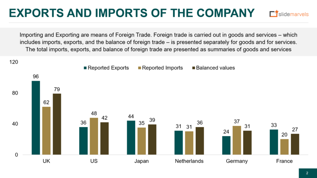
Crafting Compelling Comparisons with Bar and Column Charts
Leveraging Bar and Column Charts for Impactful Comparisons
Comparative data demands visual representation that’s both accurate and compelling. Bar charts and column charts fulfill this role splendidly. They’re the storytellers that vividly display variations, emphasize differences, and rank data categories. These charts will be your secret weapons.
Bar Charts: Best for categorical data, where the x-axis represents different categories, and the y-axis shows values.

Column Charts: Suited for numerical comparisons and ideal for illustrating trends within different groups.
Showcasing Trends with Line Graphs and Area Charts
Unveiling Data Trends through Line Graphs and Area Charts
For data that evolves over time, line graphs and area charts are your companions. They’re designed to visualize trends, patterns, and changes across temporal sequences.
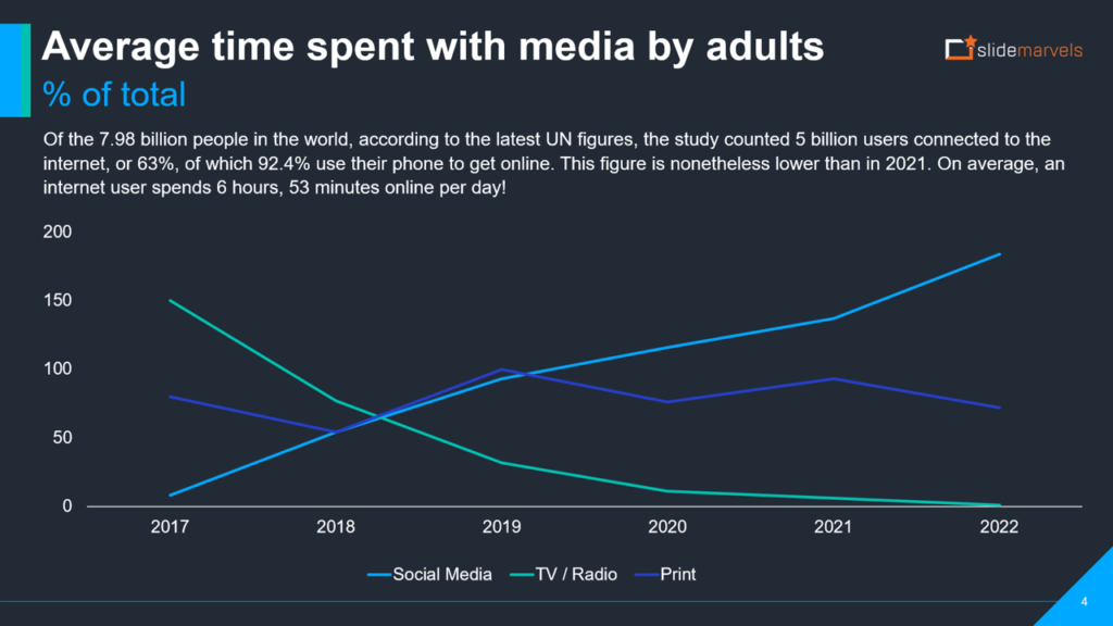
Line Graphs: Ideal for demonstrating trends and changes in data points over time. Each data point is connected by a continuous line, offering a smooth visualization of progress.
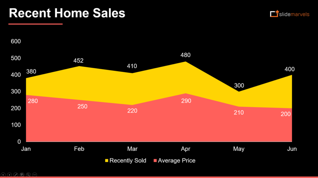
Area Charts: Build upon line graphs by filling the area beneath the line, amplifying the visual impact of data trends.
Personalizing Visuals for Maximum Impact
Customization: The Art of Tailoring Charts to Your Story
A presentation designer’s prowess lies in customization. This is where you infuse your brand identity, making charts resonate with your message.
Colors and Fonts: Match your brand colors and fonts for consistency and professionalism.
Labels and Annotations: Guide your audience by carefully labeling axes, data points, and including annotations where necessary.
Axis Scales and Bar Widths: Tailor these to ensure precision and guide viewers through your narrative.
Elevating Charts: Data Labels, Legends, and Trend Lines
While charts themselves speak volumes, enhancing them with supplementary elements elevates their impact.
Data Labels: Quantify data specifics, making trends and values easily interpretable.
Legends: Decode complex datasets, aiding audience comprehension of data categories.
Trend Lines: Highlight patterns and trends, making your data’s story more accessible.
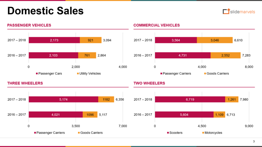
Embracing Diversity: Stacked and Clustered Variations
In PowerPoint, embrace the versatility of stacked and clustered variations in chart design. Stacked charts dissect total values into components, revealing proportions within a whole. Clustered charts, on the other hand, allow side-by-side comparison of multiple datasets. These variations empower presentations with dynamic visuals, unraveling intricate data relationships with clarity and precision.
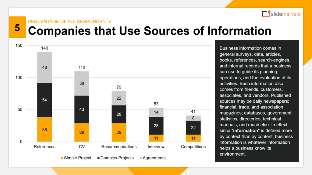
Stacked Charts: Visualize data composition by breaking down total values into components, offering insights into proportionality.
Clustered Charts: Enable side-by-side comparison of multiple datasets, facilitating a holistic understanding of data relationships.
Step-by-Step Guide: Crafting Your Own PowerPoint Chart
Mastering the creation of PowerPoint charts is an empowering journey that unfolds through a systematic step-by-step process. This process grants you the capability to elevate your data into a captivating visual representation. With each deliberate action, you infuse clarity, precision, and context into your charts, allowing your data to radiate with brilliance. This methodical approach ensures that every aspect of your chart, from data input to customization, contributes to its illuminating effect. As you navigate this process, you’re not merely crafting charts; you’re sculpting a pathway for your data to shine brilliantly and illuminate your narrative.
Select Your Data: Begin by compiling the data you want to visualize.
Insert Chart: In PowerPoint, navigate to the “Insert” tab and choose the chart type that suits your data.
Input Data: Input your data in the spreadsheet that appears, ensuring accuracy.
Customize: Utilize PowerPoint’s customization options to tailor your chart’s appearance.
Labels and Annotations: Add labels, annotations, and legends to enhance clarity.
Review and Refine: Review your chart, ensuring it aligns with your narrative. Make refinements as needed.
Presenting Data with Impact: Best Practices to Remember
Mastering PowerPoint charts is an art, and every artist has their toolkit of best practices.
Simplicity: Avoid clutter; keep your charts clean and easy to understand.
Consistency: Maintain uniform fonts, colors, and labeling throughout your presentation.
Context: Always provide context and explanations for your data.
Engagement: Craft your charts to engage and captivate your audience.
The Art of Visual Storytelling
In the role of a presentation designer, your objective transcends mere data representation. Your mission is to delve deeper and construct a coherent narrative from the data. You are the visual storyteller who transforms raw figures into a compelling tale that resonates with your audience, making the information not just understandable, but relatable and memorable. Your expertise lies in crafting charts and visuals that guide your audience through a journey, helping them grasp insights, connections, and trends that shape the narrative within the data.
Narrative Flow: Structure your charts to guide your audience through a clear story.
Impactful Communication: Visuals resonate better, ensuring your message is heard and remembered.
Audience Connection: Charts bridge the gap between raw numbers and relatable insights.
Conclusion
Empowered with the knowledge of PowerPoint charts and graphs, you’re poised to take your presentations to new heights. Whether you’re a presentation designer, part of a PPT design agency, or simply someone seeking impactful communication, data visualization is your gateway to engaging and informative presentations. Slide Marvels is your companion on this journey, helping you master the art of visual storytelling, one chart at a time. Contact us today to take your presentations to the next level with our expert design service. Elevate your presentations, captivate your audience, and make your data truly shine with the magic of PowerPoint charts and graphs.