
Data Visualization Made Easy: Using Charts and Graphs in Google Slides – Slide Marvels
In today’s data-driven world, the ability to convey complex information in a clear and compelling manner is a valuable skill. Whether you’re a business professional, educator, or a presenter, effectively communicating data can make the difference between a forgettable presentation and a memorable one. Google Slides, a popular and user-friendly presentation tool, offers a powerful suite of features to help you bring your data to life through charts and graphs.
At Slide Marvels, we understand the significance of data visualization, and we’re committed to helping you master it. In this comprehensive guide, we’ll walk you through the art and science of using charts and graphs in Google Slides to simplify data, enhance understanding, and captivate your audience.
Why Data Visualization Matters
Data visualization is the art of representing data in a visual format, such as charts or graphs, to make it more accessible and understandable. Here’s why it’s crucial.
Clarity
Visuals simplify complex data, making it easier for your audience to grasp the information.
Engagement
Charts and graphs capture attention and keep your audience engaged throughout your presentation.
Decision-Making
Well-designed visuals enable better decision-making based on data insights.
Memorability: Leaving a Lasting Impression
People remember information presented visually better than raw numbers or text.
Getting Started with Google Slides
Before we dive into the world of data visualization, let’s make sure you’re comfortable with Google Slides.
Access Google Slides: Sign in to your Google account and open Google Slides.
Create a New Presentation: Click on “Blank” to start a new presentation.
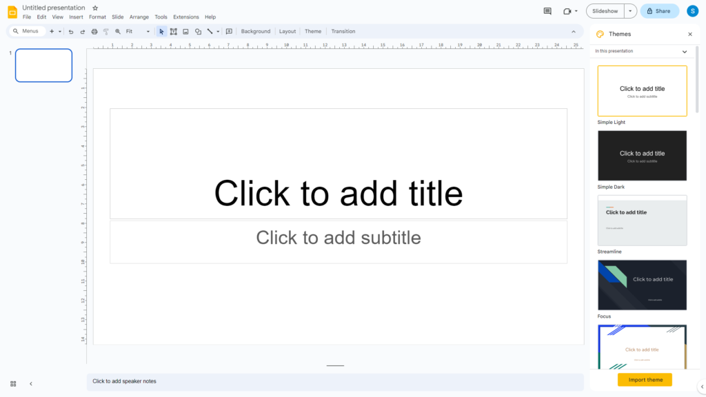
Insert a Slide: Use the “Slide” menu to add a new slide where you’ll place your chart or graph.
Choosing the Right Chart or Graph
Selecting the appropriate chart type is crucial. Google Slides offers various options, including bar charts, line graphs, pie charts, and more. Consider these factors:
Data Type
Choose a chart that suits your data, e.g., use bar charts for comparing categories or line graphs for showing trends over time.
Audience
Think about what will resonate best with your audience. Simple visuals work well for general audiences, while more complex data might require advanced chart types.
Message
Ensure that your chosen chart type effectively conveys the key message you want to communicate.
Creating and Customizing Charts and Graphs
Now, let’s dive into creating and customizing your charts and graphs.
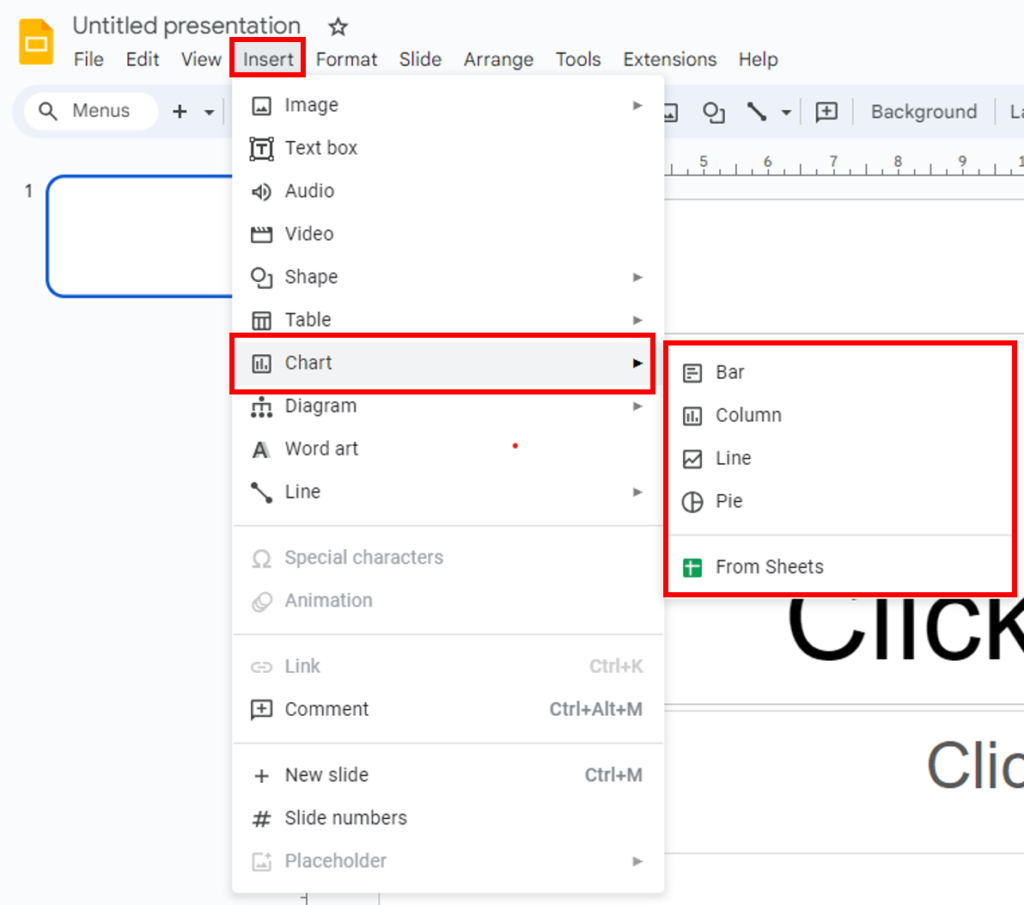
Inserting a Chart
In Google Slides, go to “Insert” > “Chart.” A spreadsheet will open where you can enter your data.
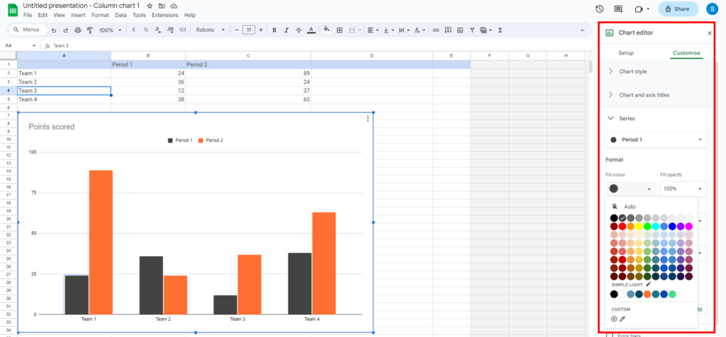
Customizing Data
Input your data into the spreadsheet, and Google Slides will automatically generate a chart. You can customize the chart title, axis labels, and more.
Changing Chart Type
If you want to change the chart type, click on the chart, then click on the chart type icon in the toolbar.
Color and Style
Customize colors, fonts, and styles to match your presentation’s design. A visually cohesive presentation is more impactful.
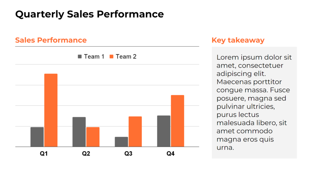
Adding Annotations
Include annotations, labels, or data points to provide context and enhance understanding.
Interactive Charts
Google Slides allows you to create interactive charts to engage your audience.
Clickable Elements
Make elements of your chart clickable to reveal additional information or slides.
Data Filters
Add filters to allow your audience to explore different aspects of your data interactively.
Tips for Effective Data Visualization
Here are some tips to ensure your data visualization is effective.
Simplicity
Keep it simple and avoid clutter. Highlight the most critical data points.
Storytelling
Use your charts to tell a story. Explain what the data means and its implications.
Consistency
Maintain a consistent style and color scheme throughout your presentation.
Practice
Familiarize yourself with your presentation so that you can explain your visuals with confidence.
Conclusion
Data visualization is a potent weapon in your presentation toolkit, and Google Slides ensures it’s accessible to all. Mastery of chart and graph usage is your gateway to simplifying intricate data, captivating your audience, and delivering a message with profound impact.
At Slide Marvels, our mission is to empower you to craft truly exceptional presentations. Whether you’re just starting or a seasoned presenter, there’s always room to enhance your data visualization prowess.
So, the next time you’re tasked with presenting data-rich information, keep Google Slides in mind as your ally in transforming statistics into a compelling visual narrative that resonates deeply with your audience. Stay tuned for a continuous stream of tips, tricks, and insights from Slide Marvels, order now for dedicated to elevating your presentation game. Let’s embark on a journey of visual storytelling and happy visualizing!
P.S. Stay tuned for our next edition, where we’ll unravel the secrets behind designing PowerPoint presentations that leave a lasting impression!
Connect with us: Website – slidemarvels.com | Twitter – SlideMarvels | Instagram – slidemarvels